Here's a sneak peak of one of the card portraits that I'm creating for ‘The Card Counter’ movie poster.
Getting the style down for this was pretty challenging as it’s a little different from my usual work. But the end result was rewarding.
Who’s looking forward to this movie?

Jan Senior
A few weeks ago I decided to create a portrait of my wife’s grandfather, who passed away sometime ago, for her grandmother.
Since we moved to Slovakia, my wife’s grandmother has been very kind, checks in with us daily and has cooked many delicious Slovak favourites for us - including her amazing perogies!
With this portrait I’ve continued on with combining Photoshop and Artrage in my process.

A Chance Beginning - Book Cover
Here’s my latest cover illustration for “A Chance Beginning” by Christopher Patterson.
Creating the characters and the background city was challenging but I really enjoyed designing those elements and then tying them all together for this painting.

Heavenly Thunder, A Noble Sins Novel - Book Cover
Here’s my latest book cover illustration for “Heavenly Thunder” by Dana Jeffrey Crotts, which is the second in his ‘Noble Sins’ series.
I had a lot of freedom with this particular book cover and, after reading through the synopsis that Dana sent over, I went ahead and created some ideas that incorporated quite a few of those elements.
Consequently, those sketches just felt way too busy and so I opted for an image that told a part of the story but one that also looked like it was in the same series as the first book - Rude Awakening.

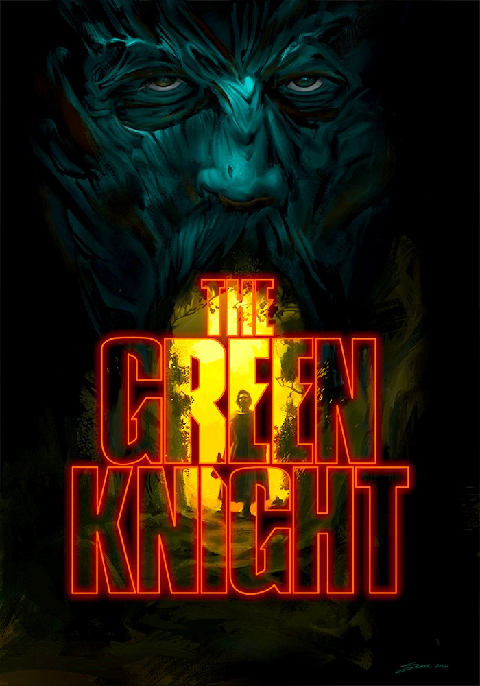
The Green Knight - Movie Poster Concept
Here’s the latest in a series of movie posters that I’m currently creating. I was drawn to this particular film for a couple of reasons. First, it’s a medieval fantasy and second, the classic underdog story of King Arthur’s young nephew who courageously accepts a daring challenge from a strange Green Knight.
Sergio Aguero
Here’s my finished painting of soccer player Sergio Aguero who plays for Manchester City. This was another painting where I added the retro directional effect, to make the illustration a bit more interesting. I also went back to the Photoshop/Artrage combo to see if the traditional look and feel that I’m developing would work for this type of illustration.

Leon Draisaitl Painting
Here’s my finished painting of Leon Draisaitl of the Edmonton Oilers. If you’ve been following my work, you’ll know that I’ve never created a ‘sport’s’ related painting ever. That’s about to change as I wanted to try something new, break out of the stuff I usually do and just challenge myself with a different subject. I also decided to experiment with the retro 'pixel stretch' effect to make the painting more dynamic overall. There were a lot of challenges and details to get right with this illustration but I stayed the course, concentrated on one challenge at a time and I’m proud of the finished painting.
•
If anyone’s interested, I created a behind the scenes sped up time lapse video of how I developed the painting on my new youtube channel, here’s the link: https://youtu.be/AwAtnV9cOs8
•
Are there any other pro athletes that you'd like to see me paint?

Wrath of Man - Alternative Movie Poster
Following on from my portrait sketch of Jason Statham, I decided to go ahead and create an alternative movie poster. I really like the 60’s and 70’s film posters so I borrowed some of the aesthetics from those and mixed it up with a more modern approach.
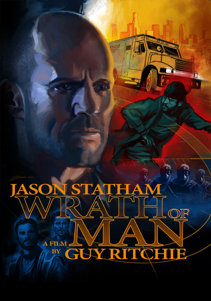
Wrath of Man Portrait
In anticipation of the Wrath of Man movie directed by Guy Ritchie, starring Jason Statham, I decided to go ahead and create this portrait illustration.
•
“The plot follows H, a cold and mysterious character working at a cash truck company responsible for moving hundreds of millions of dollars around Los Angeles each week.”

Stone of Chaos: Demon's Fire Book 2 by by Christopher Patterson
This is the second book that I collaborated with Chris on and I had a lot fun creating this cover illustration.
•
"An ancient evil reemerges, one that once caused devastation and chaos the world had never seen before, and had not seen since. Journey with Erik Eleodum as he searches for the Stone of Chaos and seeks a way to thwart the return of the Lord of Chaos…"
•
If you're interested in learning more about the book, and the series, it's available as a Kindle Edition on Amazon.

American Psycho - Movie Poster
I'd all but finished the painting when I realized that the poster seemed to be lacking in some way. I took a quick break and when I came back I decided to quickly add in some embellishments to the bottom of the painting to see what it would look like. I figured that it would be a quick change and if it still didn't look right then I'd just go with the previous version. And that seemed to do the trick! I'd found the missing x-factor that turned this painting into a much more striking final image.

Erik Eleodum
Here's a character illustration I’ve just completed for one of my clients who is an independant fantasy author. I really enjoy working on fantasy art projects like this one as they’re always a welcome escape from real life for me.

Personal Style
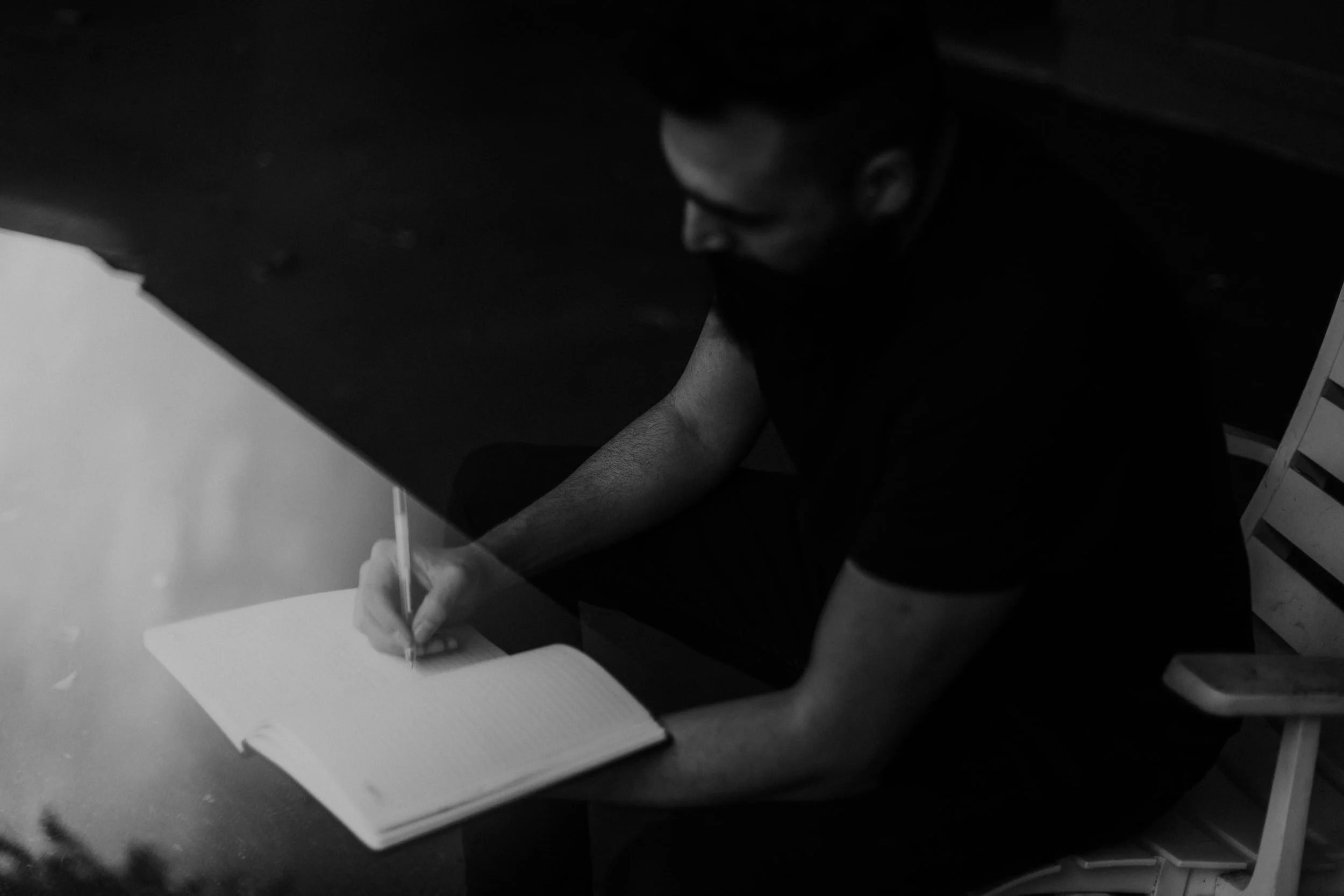
As I’ve mentioned in previous blog posts, I took the ‘Ideation & Visual Storytelling’ online course with Visual Arts Passage last summer as I’d been unhappy with my painting style for some time. During the course the instructor suggested a number of things to unearth your own unique style so that your work is more personal and interesting. I tried them all, Including the one that I thought really wouldn’t help me (which of course was the one thing that was the most helpful).
Journaling turned out to be most useful of all the tips that I received. To be honest, I wasn’t really interested in trying it to begin with as it sounded a bit too woo-woo to me and it was the last thing that I went and experimented with. But after I sat down and started writing down what I wanted my work to look like, it began to focus my mind more acutely on those elements.
Now after every painting that I create, I’ll spend about 15-30 minutes writing about what I felt went well on the painting, what needs more work and what I want to focus on next.

The other thing that has really helped me, as a result of the journaling, is that I spent some time and really honed down the artists whose I work I admire and the aspects of their work that I’ wanted to incorporate into my own personal style. This was pretty challenging as I get inspired by a lot of different artists so I had to be a bit ruthless about the sorts of things that I wanted my style to include.
I managed to get the list down to about 10 artists and since then I’ve started to analyze their work and how they go about describing different elements in their paintings, their compositional choices and the lighting they’ve used.
A few other thing's to try are:
• Experiment with a different medium that you don't have complete control over
• Create a painting or sketch from life
• Create art with a specific time limit
• Spend time looking at art where the subject matter isn’t what you ‘always’ gravitate to
• Think about the aspects of paintings that you really like and try to include those in your own work
• Create a list of thing's you like (such as movies, music and environments) and think/ write about why you like them
Morning Read
What started out as another photo study turned into a finished painting, called Morning Read. This is another step towards developing a personal style which is more painterly and expressive.

Casablanca
This was the final painting I completed for the ‘Ideation and Visual Storytelling’ course at Visual Arts Passage. For this assignment we were tasked with creating a cover illustration for a Criterion Collection DVD/Blu-ray/streaming version of a film. I’m a bit of a movie buff and so narrowing down just one film that I’d like to create a cover illustration for actually proved to be the hardest part of this project for me. But in the end I chose Casablanca as it’s one of my top 10 movies of all time. I’ve watched this film countless times and it just never gets old. For this image I wanted to convey the darkness of the Humphrey Bogart character, Rick, and also how the return of his former love Ilsa would change the course of his life. This painting marks my second step on the path towards creating a looser, imperfect and more painterly style.

Nightfall
I recently signed up for the ‘Ideation and Visual Storytelling’ course at Visual Arts Passage and for one of the assignments I had to illustrate a scene from a sci-fi short story and I chose “Nightfall” by Isaac Asimov. Written in 1941, “Nightfall" is a novelette about the coming of darkness to the people of a planet ordinarily illuminated by sunlight at all times.

5 Easy Steps to Problem Free Painting
There's various ways I start any painting, be it a personal piece, a promotional illustration or a professional commission. My favourites are word association, colour combinations, inspiration from other artists, music, movies, sketching, abstract shapes and meditation.
Read More
Today's Lunchtime Sketch

Diversion 2020
The last few months have brought a lot of challenges and to help me work through some of the things that I'm experiencing and visually express how I'm feeling about it all I decided to create this painting. I found the cathartic process has certainly helped me take a breath and somewhat come to terms with all the dramatic changes that I'm going through during this crazy time.
JUDGE ANDERSON - 2000AD ART STARS COMPETITION
I decided to go ahead and enter the 2000 Ad Art Stars competition again and this time the theme was Judge Anderson. For this painting, I wanted to highlight the character in a dynamic way, show a hint of Mega-City One and include her arch enemy, Judge Death. In the end I went with a night scene which seemed to go well with the overall dark vibe.
